Calculating "left-ness"
Where can the left win in New York State?
NOTE: This is the free version of a paid article I released 48 hours prior. If you are a paid subscriber, you should read that version here. In addition to getting the article early, it contains Google Drive links to all the maps and spreadsheets I created for this article.
Today I am going to be doing something I promised in my first post: attempt to write a formula for calculating how left-wing a given political district in the state of New York is relative to all other districts. If you are a baseball fan, you can think of this as a kind of political rate stat. It has taken a while, but I hope it will have been worth the wait. This formula is going to do a few key things:
The “leftmost” district in the state according to our formula will have a value of 1.0000, the least will have a value of 0.0000
All other districts will have a value somewhere between 0.0000 and 1.0000 which can be used to sort and compare districts
It will be relatively simple and easy-to-explain, while it won’t look like that is the case in formal notation, this article will explain exactly what every element of the formula does
An aside on math education
At this point in this newsletter’s existence, no doubt you have noticed I sometimes go on spuriously related tangents. I am afraid this is one of them, but due to the nature of this topic, I am rather insistent on starting with it so it is clear you won’t need a PhD to understand what I’m doing here. Skip past this section if you’d prefer to get right into the meat of this.
I learned math as I am sure many of you did, in a large underfunded public high school with 40-person class sizes and an eye towards one thing: making sure as many warm bodies as possible passed the NYS Regents Exam in June. This did not work very well for me. I outright failed a semester of high school geometry. I’ve never so much as taken a formal calculus class. Five years later, I am writing this.
To be clear, I do not blame my teachers. But I cannot help but wonder how many people had similar experiences, and how few of them also accidentally fell backwards into finding a way to enjoy math as I have.
Some of you are going to see bizarre symbols and syntax below, I’m gonna do as best as I can to explain what is going on without losing detail. On the flip side, some of you may expect this to have the format and language of an academic paper, it won’t because that is simply not my background.
So if you hated math but for some reason are reading this, perhaps consider learning how it can be applied to things you are interested in. You may be surprised as I am and find out that you actually enjoy it. Believe it or not, I loved the trial-and-error that went into making this, and I encourage you to experiment around and perfect it even further.
With that said, I’ll show you the formula if you promise not to stop reading. Deal? Deal:
This is a case of something being very syntactically dense but not actually that complex in content. By the end of this article, you’re going to understand exactly what it all means. We’re going to pretend you didn’t even see that formula and get into motivating what we’re doing today.
In search of an indicator
To get a sense of how we are going to accomplish this, we first need to understand how candidates are elected in the first place. In order to be elected, candidates must:
Enter and win a closed Democratic Party primary
Win the general election campaign
This may seem rather barebones but I explicitly state it as it will be quite important to in our exploration of metric which may be indicative of vague progressivism. Candidates have to win two elections, and while we don’t usually think of them this way, even under the exact same district lines the dynamics in those two races may be dramatically different.
While I think this is such an intuitive idea it is often taken for granted, the partisan lean of a district has a shockingly insignificant influence on the ideology of candidates their primary voters will nominate. There are very liberal districts that nominate very moderate candidates for the legislature and very conservative districts where the Democratic primary voters are extremely progressive, though obviously without a chance of actually electing the candidate they nominate. For these reasons, the partisan makeup of a district alone is not particularly relevant to the ideologies of Democratic primary voters there. What it is extremely relevant to is the chances of that candidate winning the general election. Remember this, we’re gonna get back to it later.
With the rejection of partisan lean as a good indicator of ideology, let’s get into the reasons why I won’t use several other apparent metrics.
Renter percent
One metric that is often used to get a sense of where progressives likely live is the share of renters in that area. This makes a lot of sense in most parts of the country as urban voters with few assets correlate stronger with the success of progressive candidates than other relevant metrics like age and education. With that said, New York is rather unusual in that rates of home ownership are the 50th in the nation at 53.6% compared to 65.7% nationally while also being the 12th wealthiest state by median family income, $74,314 vs $69,717 for the nation at-large. Renting simply is not as indicative of economic class, age, and with it voting tenancies as it is in other places. It is not a complete irrelevancy particularly upstate and in the suburbs, but it cannot unto itself isolate progressives statewide.
Individual primaries
Another commonly used metric for this kind of analysis is the result of an individual primary, for example how well Bernie did in 2016 or specific to NYS how well Cynthia Nixon or Jumaane Williams did in 2018. To begin, the Bernie 2016 vote seems more apparently an anti-Hillary vote than a pro-Bernie vote. Amongst Bernie’s best neighborhoods in 2016 were famously conservative Howard Beach and Breezy Point. It certainly gets us closer to what we are trying to track, but there are clearly other factors at play.
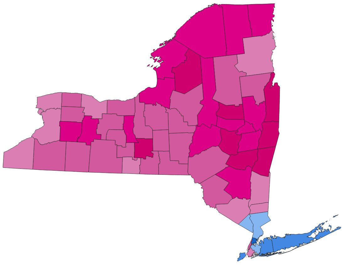
Another interesting conduit would be the 2018 governor and lieutenant governor primaries. In that cycle, Cynthia Nixon and Jumaane Williams ran a high-profile campaign against incumbents Andrew Cuomo and Kathy Hochul. What resulted were two pretty fascinating though losing coalitions. While Nixon carried 13 upstate counties against Cuomo and Williams only two plus the boroughs of Manhattan and Brooklyn, Nixon lost her primary by 31 points while Williams came within 7 points of unseating Kathy Hochul on the same ballot.
This difference gets even more impressive if you abstract their coalitions out to an exact two point win, as I have done below:
For Cynthia Nixon to have won, she would have needed to win upstate New York by some 25 points, every county in the state. In exchange, she could lost the suburbs by a similar margin and even lose the city itself, though keeping it close enough to remain viable.
For ostensible running mates in a race on the same ballot, the differences in this coalition are unbelievable. For Jumaane Williams to win by the exact same margin, he could have lost upstate and the suburbs by about 20 points while winning the city by 18 point, the only changes in outright county wins being the borough of Queens, mostly Republican Greene County, and Ulster County.
One thing worth noting about these coalitions is while there are multifaceted reasons for the differences, they show an interesting regionalism. While Nixon is from Manhattan, Queens-bred Cuomo was a chronic underperformer upstate for most of his tenure as governor. Though in part because of a strong Green Party performance, he outright lost the solid blue counties of Monroe and Ulster in 2014 and would lose Columbia County twice, both in 2014 and later in the 2018 cycle.
The Hochul-Williams race meanwhile is a bit more complicated. Kathy Hochul was at this point running for her second term as Lieutenant Governor, a position with much historical turnover and far less of a profile than her former role as a congresswoman. Being a Buffalo area pol, this is why she performed so well in Western New York. Jumaane Williams meanwhile was fairly well-known as a City Councilor in Brooklyn and most notably unlike Nixon got the endorsement of the New York Times, which carries tremendous sway in the metro area and I would argue is probably a prerequisite for a successful progressive campaign at this level of play.
These notes are interesting to make when thinking about statewide campaigns and I will likely go further into them in the future, but they also for our purposes today reveal their flaws. When we look at individual primaries there are always going to be factors far more complicated and difficult to isolate than mere ideology. So, we have to keep looking.
Presidential primary blank ballot
An interesting candidate for these purposes has emerged recently in the form of a campaign mirroring “uncommitted” campaigns in other states by blanking the presidential primary ballot in opposition to Biden’s policy regarding the present war in Gaza. It got 12% statewide but as of time of writing given there is no uncommitted option in New York and blank votes have only been tabulated at the congressional level, there is no precinct level data to utilize. If such is compiled, I may revisit this.
Enter the WFP
As you probably know, Governor Hochul faced an unexpectedly competitive race for re-election in 2022, winning in the end by a mere 6.4 points in the face of dramatic downstate swings towards Republican Lee Zeldin. What you may not remember is that the Working Families Party made a significant GOTV effort to turn out progressives for Hochul, of course on their separate Working Families Party line.
New York is one of few states in the country to allow ballot fusion, that is the crossnomination of candidates of another party while maintaining their own ballot line. This practice began as a reform against political machines, maybe one would vote for a “Reform Democratic” ticket which had different names for local officials but the standard Democratic nominees for higher offices such as Governor or President. One can think of a vote on the Working Families Party line as “Democratic, but I’m not happy about it.”
Because of this concerted campaign and the specific efforts to reach progressives, this means that for every precinct in the state we can get a pretty good idea of how many dedicated progressives are there relative to more general Democratic voters. It is not perfect, but it is a good jumping off point for our purposes.
Beyond what I have already stated and the recency of the election, it is also worth noting that because of Hochul’s dramatic under-performance, there is an added benefit in giving us about the absolute floor of how a Democrat can do in a particular area of New York. This will become important later as we get into weighing in odds of winning the general election.
Into the math
To begin, it may help to see an example of what these numbers all look like in practice.
Here are county level results for the 2022 governor’s race, pulled straight from Wikipedia. For each county, we can see how many people voted for Hochul for the two parties she was on the ballot for, the Democratic Party and the Working Families Party. The next column is a sum of those two vote totals, the “fusion” in fusion voting. All votes for a single candidate are summed together regardless of the party affiliation. This continues for Zeldin’s two parties.
Let’s go back to our ridiculous formula:
Remember when I said this was a lot more syntactically complex than it actually was? The first two lines are emblematic of this. The D in this case stands for the Democratic party’s share of the vote in a given district, and the W in turn the Working Families Party’s share. In the curly braces, this should be thought of as a list of numbers. The subscript of each variable simply refers to the number of the item in the list. There are k districts, an equal number for both the Democratic and Working Families Party vote. Take for example our congressional districts, there are 28 of them. That means k = 28 in that case and each list contains 28 items, in this case decimals corresponding to the percentage share of the vote for a political party.
Take for example NY-01, a congressional district on Long Island. Within that district, 39.98% of people voted for Hochul on the Democratic line and 2.10% of people voted for her on the Working Families line. Expressed as a decimal, that would mean d₁ would be .3998 and w₁ would be .0210. This continues for all districts until our list is full.
Now onto the second part. All this is doing is calculating the “ratio” between the percentage of the vote for Hochul on the Working Families line against Hochul’s total vote share. For example back to NY-01, the value for r₁ would be as follows:
.0210/(.3998+.0210) = .0210/.4208 = .0499
That is to say of voters who voted for Kathy Hochul in NY-01, 4.99% of them voted for her on the Working Families Party line. We will be using this r value in the following part of our formula to give us an idea of how progressive primary voters may be in a specific district.
The next part has two giant fractions multiplied by each other. We’re going to look at the first fraction first, and then the second. You will shortly understand why.
What this part of the formula does is normalizes our ratios from their current form to a number between 0 and 1 where 0 is the district with the lowest ratio and 1 is the one with the maximum ratio.
The “min” and “max” each find the minimum or maximum value for a district respectively. In finding those, for the numerator we subtract the minimum from the ratio of our current district, and for the denominator we subtract the minimum from the maximum ratio for all our districts (this can be thought of as the “range” of our values).
For an example, let’s say we have three districts where the WFP relative to the Democratic Party got 30%, 18%, and 4% of the vote. We already know which of these would be our minimum and maximum, but let’s run the calculation for our middle district.
(.18-.04)/(.30-.04) = .14/.26 = 0.5385…
So for our 18% district, assuming the 30% district is 1.0000 and the 4% district is 0.0000, this formula would spit out a value of 0.5385. But not so fast…
That 0 to 1 value that we calculated gets multiplied by the output of this very confusing looking formula. It gets quite simple though when I explain the motivation for it.
As we’ve discussed earlier, progressive candidates need to effectively win two elections: first the primary election, and then the general. The electorate of primary voters tends to be pretty fairly represented by our ratio, i.e. what share of voters for the Democratic candidate are likely to be progressive in a given district. But that number alone cannot account for their viability in the general election.
This is where our formula comes in. I won’t touch much on the math as it is a bit beyond the scope of this article, but it is what is known as a sigmoid function. Basically, it creates something of an s-shaped curve. Below is the curve created by this function.
As you can see, this curve dramatically increases between 0.4 and 0.6, from a practical flatline at 0 to steady at 1. Why is this useful to us? Take those decimals on the x axis and imagine them as percentages. Values increasing dramatically between 40% and 60%? That sounds like the range of results for a candidate in the general election that would determine their viability.
So the reason we multiply it along this curve is to determine general election viability. If Hochul got 45% of the vote in a district, we can probably surmise that the district is shaky for the Democratic Party and thus should be lower on our scale. For a further idea of the effect of this, here are some Democratic Party percentages and what the viability factor this formula spits out. Keep in mind being multiplied by 1.0000 would be the original value, being multiplied by 0.5000 would be half the original value, etc.
65.0% = 1.0000
60.0% = 0.9999
57.9% = 0.9990
55.6% = 0.9900
53.2% = 0.9000
51.0% = 0.5000
50.0% = 0.2689
48.8% = 0.1000
Now on to the fun part. What do these numbers actually show us in relation to real political districts?
Precincts
Precincts can be thought of as the building blocks of larger political districts. They are the most granular level at which we can get this kind of election data and for that reason while of little practical use on its own, it may make sense for us to begin by taking a look at the map of our formula applied to individual precincts— all 13,963 of them. It is at this point I have to think Benjamin J. Rosenblatt for compiling the precinct-level data for the 2022 governor’s race that makes this all possible. It’s a very tedious process that involves wrangling with every county’s individual Board of Elections so his collection and release of that data is incredibly admirable.
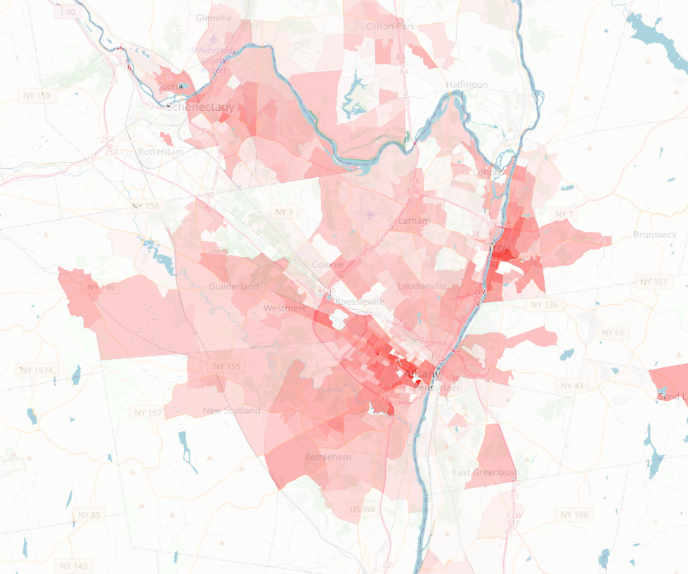
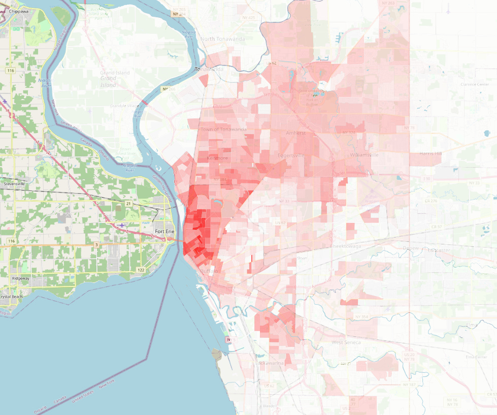
Here is a precinct-level heatmap for the state of New York. Darker reds signify a value closer to 1.0000, the “most progressive” parts of the state by our formula.
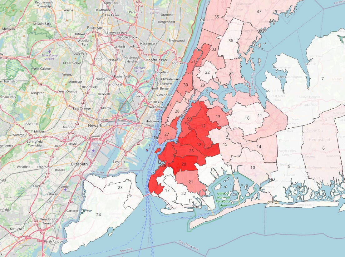
In the city, the most progressive areas are heavily concentrated in western Brooklyn and Queens. This is no doubt where our most progressive districts will generally be at all levels, though smaller areas statewide do match these levels in much smaller areas such as Inwood also in this photo.
In the Mid-Hudson, parts of Kingston get quite close to matching Brooklyn levels but several of the area’s small cities and much of Ulster County registers at significant levels.
Metro Albany is also quite apparent in this data, including the city of Troy.
Tompkins County, not just in Ithaca where Cornell is located but also in the surrounding towns is also quite apparent on this map in even brighter shades of red than most of the Mid-Hudson.
Buffalo also had an impressive share of the WFP vote, particularly in the north of the city.
The South Wedge of Rochester is most apparent on this map, but much of metro Rochester has a relatively high share of the Working Families vote comparative to other metro areas in the state.
State Assembly
Now that we have an idea of where the hotspots are at a more granular level, let’s get into the real meat of this article. What does this formula tell us when we apply it to more practical political jurisdictions. We will begin with New York State Assembly districts.
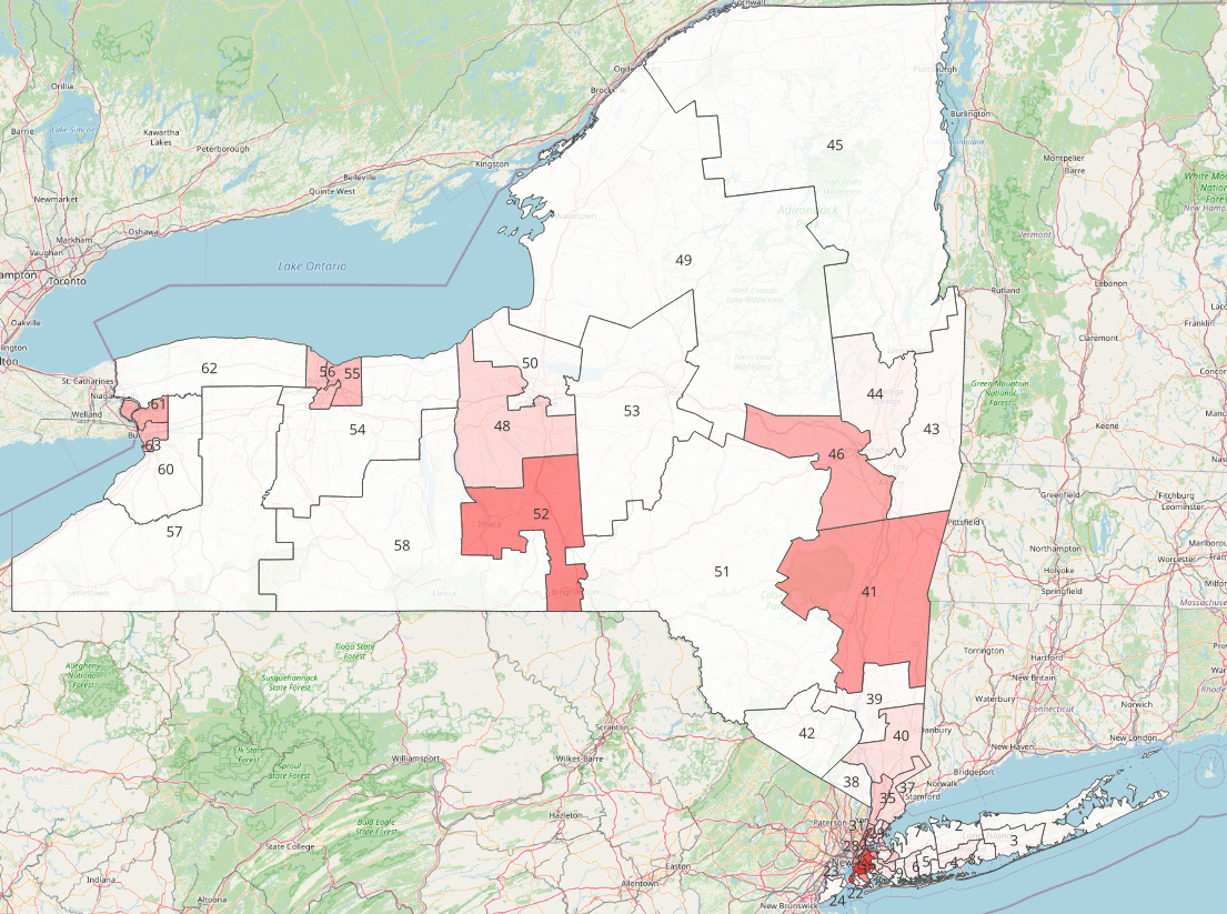
As far as upstate is concerned, we’re seeing a lot of what we would expect. The reddest districts contain Kingston and Ithaca respectively, but other districts for bigger metro areas also show respectable values.
In the city, we’re also seeing much as we expect with a very distinctly dark red for the districts along the East River in Brooklyn and Queens.
The maps are interesting, but what does the actual raw data look like? I’ve put it in a spreadsheet below, and as with the maps it will be accessible at the end of the paid version of this article.
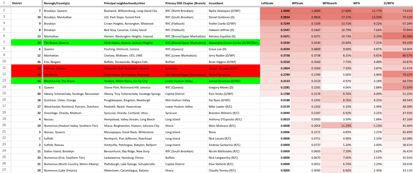
Few notes before I begin. “LeftScale” is our full formula including with the scaling to the general election, “WFScale” is our formula without any scaling to the general election. The other columns should be pretty self explanatory but just in case “WFShare%” is the WFP share of the combined Democratic and Working Families vote, “WF%” is the raw percentage the Working Families Party got, and “D/WF%” is the combined share Kathy Hochul got in that given district.
Another thing: I have highlighted these districts according to if a DSA candidate has won it before (green), is currently running for it (yellow), or lost a race for it (red). I do this in part because I am a DSA member but also because I didn’t want to be making individual case-by-case determinations of what races have had progressive candidates and whether the most progressive candidate won. Highlighting only DSA candidates offers a small sample of the very most progressive candidates. With that said, I will mention interesting races with non-DSA candidates from time to time.
I don’t think I could have fabricated better data if I tried. Of 150 members of the New York State Assembly, every DSA elected fits into the top 13 values, with no losses in that range and two ongoing races. This includes Sarahana Shrestha of the Mid-Hudson Valley, with a value of 0.5099. This should not be thought of as “DSA candidates can only win in districts with a value above 0.5000,” but it’s interesting how cleanly the data here worked out.
Not pictured amongst DSA candidacies is Jonathan Soto’s current race in the Bronx’s AD-82 with a LeftScale of 0.0921, 61/150 assembly districts and which he lost last cycle under similar lines. Additional mentions for DSA losses are AD-95 around Peekskill and Philipstown (LeftScale of 0.2299, #37/150), East New York centered AD-60 (LeftScale of 0.0005, #97/150), and a primary endorsement in deep red Dutchess County AD-105 (LeftScale of 0.0000, #110/150).
Additionally it is worth mentioning Claire Cousin’s present primary against Didi Barrett in Dutchess and Columbia Counties. AD-106 gets a LeftScale of 0.1820 and is the 42nd most progressive assembly district in the state.
State Senate
In the State Senate, a very similar pattern is playing out with the Brooklyn-Queens belt having the most progressive districts in the state and the Mid-Hudson and Ithaca having similarly impressive numbers.
As far as the spreadsheet goes, we’ve got a similar clustering at the top, this time a top six of districts where DSA candidates have won every race they’ve run. Not pictured is a failed Long Island DSA race for SD-07, a district in Nassau County with a LeftScale of 0.0006, the 43rd most progressive of the state’s 63 State Senate districts.
Congress
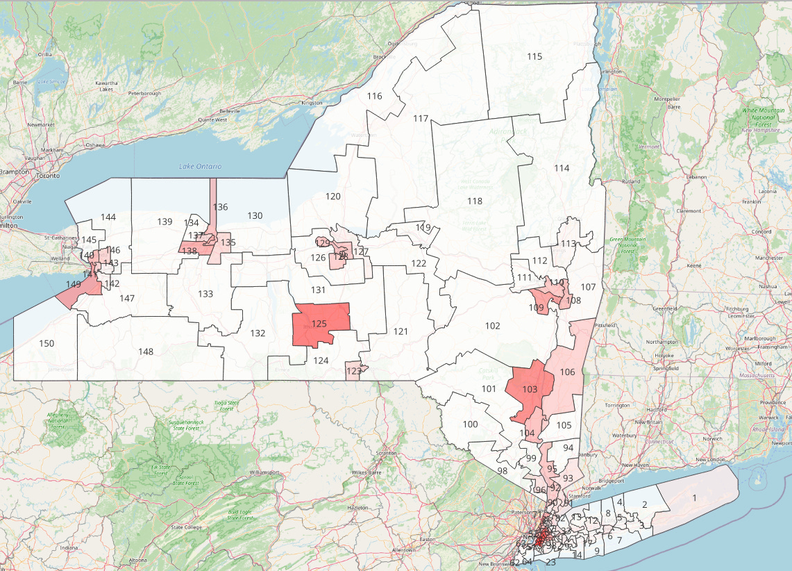
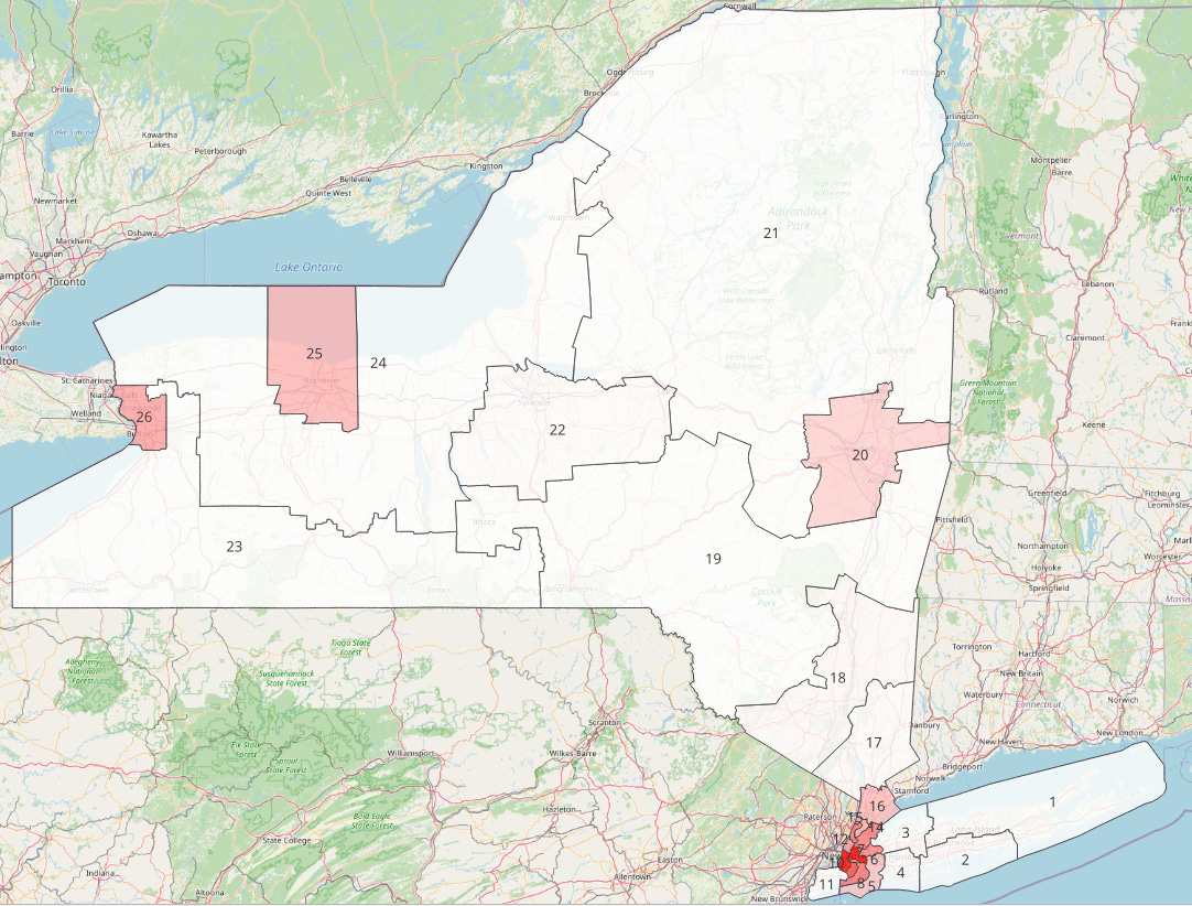
We for the record are using the new maps from the 2024 election onwards for this section. At the congressional level, Hochul’s margins were poor enough in the Mid-Hudson and Ithaca as to where they barely register on the map.
There doesn’t seem to be a great deal of correlation between where DSA candidates have won and where the WFP does well, though the dynamics of federal races are arguably quite different. Velazquez and Goldman’s districts encompass much of that prime East River Brooklyn/Queens belt and there is a dramatic dropoff to other districts. You can really see how our curving based on general election results dramatically influences these races, with Mid-Hudson/Ithaca’s NY-19 going from a relatively impressive 0.2054 before scaling to 0.0008. It is also worth noting while Jamaal Bowman was endorsed by DSA for his first victory in 2020, he no longer is a DSA endorsee.
City Council
All DSA held NYC City Council districts are as with state-level districts clustered towards the top of our results (this time the top 6/51) but unlike the State Assembly and Senate, DSA candidates have actually lost districts in that range. There were relatively unique dynamics at play (Hanif in CD-39 had most progressive institutional support besides DSA, CD-35 was an incredibly close race) but it is interesting to note regardless.
Conclusion
As mentioned earlier, the paid version of this article is going to include a Google Drive folder with all my maps and the spreadsheet below this paragraph. The maps can be opened with a program called QGIS, download QGIS and these folders and open the .qgz extension file with the program. The spreadsheet is a simple Google Sheet and as such can be viewed either online or downloaded, you can navigate between different district types with the tabs on the bottom.
This article took much longer than I anticipated so I apologize for the wait, though I should be able to get articles out quicker as we approach the summer. As always if you enjoyed this, feel free to subscribe for free or share this article with a friend. The vast majority of subscribers to this newsletter are referred by friends. If you would like to go above and beyond and get these articles two days early plus some extra data goodies, consider becoming a paid subscriber. With that said, I shall be out with another article in a few weeks.


